September 1, 2019

Suggesting emotional connections to plants consistently promotes sales.
Design with retail sales in mind
BY AUDRIANA VANDERWERF CLD
 Sometimes when I’m walking through a garden centre with two or three trolleys in tow, I spy the admiration of passing shoppers. Often, I’m stopped. “Oh, that looks so good together! What are they called? How did you choose all these?” It’s easy for me, certainly. But how can retailers create a setting that ensures their customers’ carts, and then their gardens, are admired?
Some garden centres are set up alphabetically. This is helpful if your client has a design and knows what she wants. What percentage of retail shoppers has this list? As opposed to wholesale clients, I would venture only a small percentage of retail patrons actually search for plants by name. Consumers roam; they deliberate. They pull an item into the aisle and check it out from all angles. They read the little card. This continues until they’re overwhelmed, which is about two minutes.
Some nurseries group by category: upright evergreens, spreading evergreens, flowering shrubs, full sun shrubs, full shade plants, etc. This approach seems logical, as people can browse in the section they deem they need. However, using this strategy alone may leave money on the table. It omits focal point and companion plant offerings; options that complete a ‘look,’ gratify the shopper and add to your average cart numbers! A lot is to be gained by impulse sales.
Greg Petro on Forbes.com says, “Emotion plays a role in shopping behaviour. There is a human side of in-store shopping and shoppers crave that visceral experience. According to a survey from Clicktale, “impulse shopping is alive and well in-store, as consumers are still more likely to add to their cart once inside a location.” Assuming, of course, that the store is set up to be inspiring.
Vignettes are a great way to clearly suggest plant groupings. Setting up mini ‘yards’ shows people what to group together. The caveat here: it requires a lot of square footage and even large destination garden centres may be too spatially-challenged to accomplish this.
Kevin Johnson is store manager at the Barrie, Ont., Bradford Greenhouses Garden Gallery location, and he is quick to advise there is no single methodology for set up. “For one thing, we must consider the position of the building and greenhouse. We are fortunate to have a large shaded area, so that’s where the shade plants go. But we also consider moisture requirements versus overhead sprinkler access, height and colour groupings,” Johnson says.
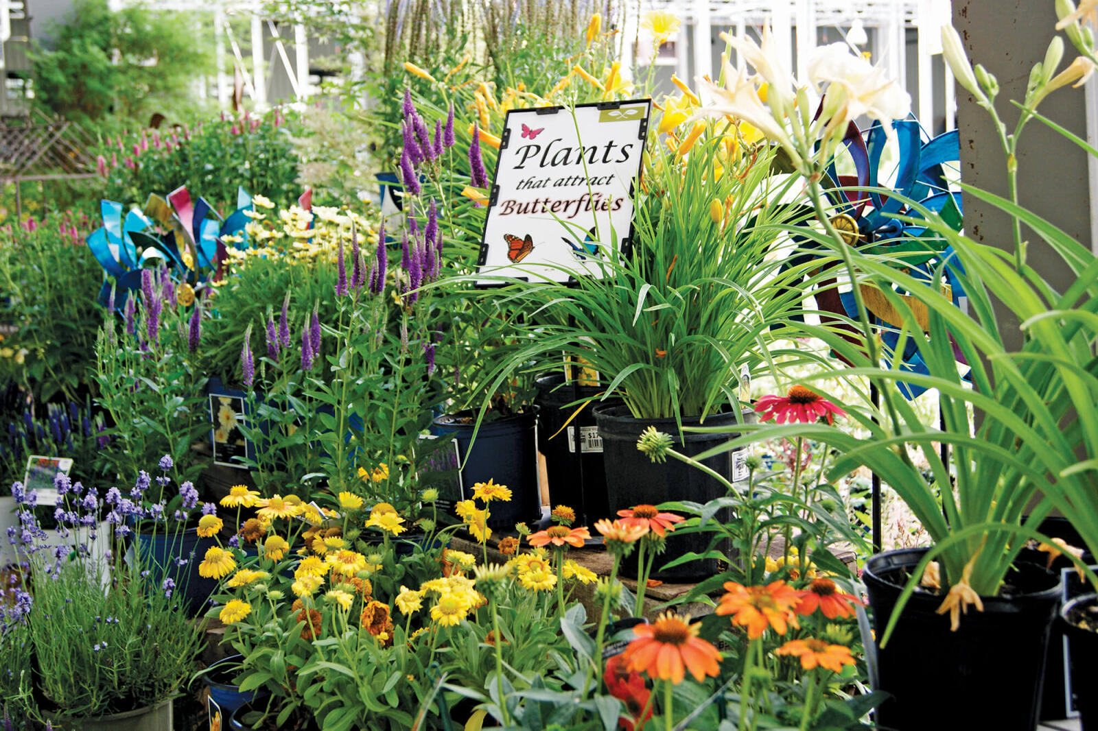
Even with Bradford Greenhouses’ 192,000 square feet, full vignettes are not possible, so Johnson’s employees create end caps and occasional displays, which are alternative opportunities to showcase a theme in a smaller way: plants that attract butterflies and bees, year-round interest, edible gardens, etc.
Opportunity Caps (hey, I just coined that! mini-vignettes in strategic locations) are informative and pretty. Used on aisle ends, middle spaces, and entrances, they can display a current theme and give customers a visual on companion plantings. This is especially helpful when staff hours are low. But most of all, this visual clue goes a long way in preventing Buyer’s Remorse. This remorse occurs when clients regret their purchases; should textures not match or the plant wilted in full sun. Are they going to blame themselves? Or YOU? Do you offer full refunds on living plants? Doubtful.
In retail, there are at least three main reasons people will continue to shop at a store: good customer service, good selection and ease of shopping, and no Buyer’s Remorse. All three of these are taken care of with a well-set-up garden centre that assists customers visually with design. Prevent BR by ensuring your customers feel confident in their choices. Have knowledgeable staff, a great layout, and Opportunity Caps in many locations.
Says Petro, “There’s nothing quite like the buzz of a compelling store experience fueled by exciting, new, must-haves.”
Audriana VanderWerf is an Ontario-based landscape design pro and a Certified Landscape Designer.